Inspiration Time: Line of Sight/Fog of War

There’s been quite a mixed opinion on line of sight and fog of war in Wayward. And while my screenshot wasn’t 100% there visually, it still illustrated a solution to a new issue. Most grid/tile/turn-based games have some form of line of sight and fog of war present. Don’t believe me? Take a look through the gallery below:

All of these games employ this model:

Fog of War

Tiles you’ve never seen; they are black and completely hidden. After seeing them, the tile will be revealed along with any object on them.

Line of Sight

Tiles and objects you can see within your realistic vision. Ones you cannot see (but previously revealed) are a slightly darker shade, visualizing that you can’t see them. NPCs are hidden, although most games will show items even out of line of sight as long as you revealed them previously. Some games instead of hidding NPCs will make them transparent to show you where they were “last seen”, kind of like a memory buffer.

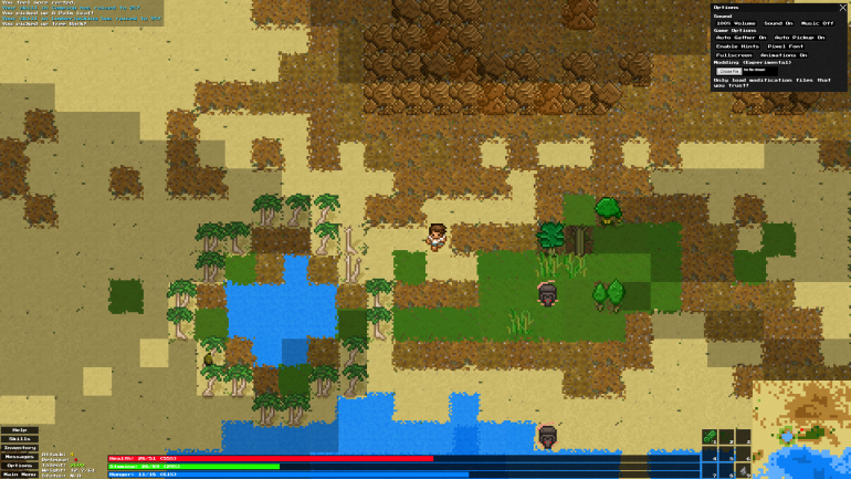
So what’s different in Wayward? Well, in the screenshot I shared, the line of sight looked more like fog of war – it was way too dark. Also, most graphical games employ some type of dithering, blurring or gradient effect to these elements so it looks better visually. I’m not sure if that one is realistic to implement quite yet – but we are still working on it.

Part of the Wayward philosophy is allowing players to play how they want to play, so of course if there enough force against these features, I may consider adding it as a mod, or adding it as a mod to remove – depending on which side the the player-base is split.

Original Image Locations:

X-COM: UFO Defense, Brogue, Dungeons of DredmoreMonacoProject Zomboid, ToME4Doom, the Roguelike

Screenshot Saturday: Line of Sight

This week we have been playing with line of sight. With the inclusion of fullscreen display, we find players can now see unrealistically out of view to a point where it’s kind of ridiculous. It also ruins some gameplay elements like being able to avoid monsters incredibly easy or seeing every resource in one view – it kind of destroys some immersion and exploration, a pretty integral part of Wayward.

While line of sight fixes this to an extent, adding back in that precious immersion, it also adds in another element: atmosphere with a hint of eeriness. Each tile has a line of sight flag. For example, you can’t see past trees or rocks, but you can see through bare trees just fine.

You may also notice something different about forests in this shot. They are much easier to navigate through, bare trees are more common and the forest floor is now peppered with saplings.

Line of Sight

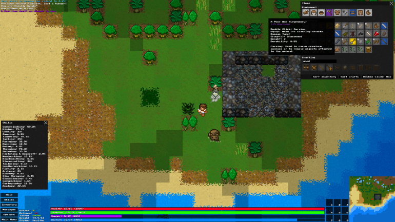
Screenshot Saturday: Fullscreen Goodness #2

So, it looks like I am doing the whole Screenshot Saturday thingy again. Why not? This weekend we are bringing you a cool preview of the new fullscreen rendering system at work. Believe it or not, this actually runs (even at this size, 1920×1080) a lot better than 1.1 due to some major rendering performance changes. There will still be an option to render a smaller game window if you want, or you can just shrink your window/browser to dynamically scale it down. Also, if you recall, I tried to do this earlier in Wayward development but was SUPER SLOW, so it was cut.

Fullscreen Preview

Patchmode: Wayward Beta 1.1.1 Released

With Beta 1.1, the bug list grew quite big. This intermediate version is used as kind of like a “patch”. It doesn’t contain too many new features – just mostly bug fixes and small improvements.

As always you can check out the changelog here:
http://www.unlok.ca/wayward-free-changelog/

There is a couple take-away points though, such as:

  • Torch improvements! Torches now have more durability across the board. Torches can now be unlighted and lit once again without being destroyed. Torches now produce a larger radius of light in general. Nighttime and caves are now darker.
  • Swimming to the map edge/borders now places you on the opposite side of the overworld.
  • Hovering over a craft item will now visually show items in your Inventory/Equipment/Quickslots that it uses in the crafting recipe.

You can play it online in the normal place:
http://www.unlok.ca/wayward/

Downloads

Windows, Mac OS and Linux versions available on IndieDB:
http://www.indiedb.com/games/wayward/downloads

NOTE FOR DOWNLOADED VERSION: Your saved game location has now changed. This means, if you run 1.1.1 and have previously run 1.1, your save file will not be used. If you want to use your 1.1 save game in 1.1.1, you will have to manually move it to the new save location which resides in a folder called “save” where ever you extracted/installed Wayward. Depending on your operating system, the old save location is possibly in one of these places:

Windows Vista/7/8:
Users\<USERNAME>\AppData\Local\wayward

Windows XP:
Documents and Settings\<USERNAME>\Local Settings\wayward

Basically, just copy that folder into where you installed/extracted Wayward, and rename it to “save”.

Wayward Beta 1.1 Released!

Play it online here:
http://www.unlok.ca/wayward/

Remember when I said I wanted faster releases? Okay, I mean it this time! It’s just that there was a lot to do in this release, and to most of the users, it should show! Some of the biggest stuff includes:

  • Resource gathering has been overhauled to match this specification (mostly).
  • Preliminary modding support.
  • Caves have been overhauled to stop all those errors, cave-ins, and generally how crappy they were. You can now even dig into caves from above!
  • Non-unique items will now stack in your inventory.
  • New HUD/user interface and hinting/help system. This will be improved over time – it’s still fairly early.
  • Skills now describe their effects via tool-tip.
  • Containers now have a drag/drop interface.
  • Items on the ground now pick-up from reverse (or newest) order.
  • New Anatomy skill and bleeding system.
  • Much more!

See full changelog here:
http://www.unlok.ca/wayward-free-changelog/

Special shout-out goes to Richard “Orillian” Hobson for all the help in programming for this release. I’d also like to thank Garret, APXEOLOG, and essial for all their great input on coding stuff as well.

Inspiration Time: World Building

A large complaint both personally, and from the players is the world/map. Current major issues with system now:

  • Sometimes a map can just be desert or non-desert biomes or very small ratios of either.
  • Lack of persistence with your map – travelling or swimming to a new one erases your old one.
  • Sometimes islands can be too big or too small in general.
  • General lack of attachment and immersion to your map due to being able to spawn a new one easily.
  • Lack of proper or forced variety.

If you have been playing Wayward for awhile, you will know that the world map has gone through some pretty crazy changes during development. Through part of the alphas, the world was infinitely generated as pieces or chunks but lacked a lot of detail or maintainability and had many of the same problems above. Next was the static map that while properly designed and balanced, lacked a lot of depth most people come to expect from roguelikes. The next iteration was what you see now. A large set of biome-centric islands with caves underneath (using pseudo z-axis).

Let’s take a look at some inspiration for another new system to address the top issues.

Dwarf Fortress

Dwarf Fortress Map

Source

I love the variety in Dwarf Fortress worlds. Although Wayward technically has more realism/variety in the tiles themselves, the world itself looks more cohesive and varied in environments. Using this map I get all sorts of fun and crazy ideas on how to fix the current system. Let’s take a look at some more:

Read more…

On Releasing a Beta & Not Shooting Yourself in the Foot

Sometimes I like to write about game design and development in general. This isn’t necessary directly Wayward-specific, but the content pertains to my feelings and choices on developing Wayward. Hopefully it’s useful to some game developers out there.

When you put something out there for consumption, people will hopefully comment and respond. The content of that response can be negative or extremely positive. The people that feel somewhere in the middle don’t usually comment. People that play and feel positively about a game usually don’t respond in any way either – it’s only the people that sit somewhere above that in their feelings for your game.

Take that in contrast with negativity. The threshold for negative comments set a very low bar. It’s easy to say: “sucks”, “terrible interface”, “bad graphics”, “boring and stupid”. It’s also easy to read these and dismiss them entirely as they don’t actually criticize anything. There’s nothing you can take away from it.

But sometimes, negative comments and feedback are good, meaningful, and important. That’s the best kind.

The difference between a good game designer/developer and a bad one is listening to criticism and improving your product.

Most People Don’t Know What Beta Means

The majority of people don’t know or don’t care that you game is beta and will take it at face value. People are used to playing games that are released as finished products. The concept of playing something that is unfinished is generally a foreign concept, especially outside of the computer gaming world.

What can you do to solve this? You need to convey that this is a pre-release to the player. You also need to provide a proper feedback-loop. Make sure you can report bugs easily. Make sure your game is playable and visual presentable. Otherwise, expect a higher ratio for that negative feedback. Sometimes it’s a necessary evil to get your game out there to get the criticism you need, even if it’s not exactly ready. I would recommend testing with a smaller group of people at the start.

Example case:

I get so sick of these games. Promise a great, immersive, deep system, and then slap the shiattiest graphics and gameplay you can on it, and top it all off with a zero learning curve…
I probably would have enjoyed this back when DOS was new and shiny, but these days I expect the Aspie code monkeys to actually talk to some graphics and game designers to make sure the game looks and plays as well as the crafting system works.

This player didn’t consider the game was a beta or that the game/gameplay was intentionally, aesthetically, retro. Most people would consider this type of thing a “troll” comment considering he even begins using personal attacks. Not cool man! You can expect these thoughts from most players, even if they aren’t this harsh or vocal about it.

That being said, is there something you can take away from this? Absolutely. In this case, it would be a hint at improving the interface. The rest of it is mostly subjective and opinionated. You can’t please every one after all. 8-bit all the way!

Most People Don’t Understand What Alternative Game Mechanics Are

Making a niche game? Using mechanics and gameplay that are foreign in comparison to mainstream gaming? You are automatically setting yourself up for negativity in some form or the other.

Example case:

I wandered around for 5 minutes, occasionally running into animals and killing them. Then I came here to see if anyone else had the slightest fucking idea what I was supposed to do or what the point of the game was. Then I closed the game and did something that made sense to me.

You could apply this quote to any open-ended, free-form game. You can expect this to be a common feeling as well. Most games provide direction and goals from the get go. Is it impossible to do the opposite? No, but don’t expect everybody to “get” your crazy-out-there game concepts.

Again, you can’t please everybody. But even this comment provides some value in improving user-experience.

Why Release a Beta?

To get feedback. To get the harshest of the harsh comments, to use that and make your game better. To give yourself a boost if you have spent too long developing and not enough time soaking in the enjoyment you are giving to players. To create an initial community. All these reasons and more is why it’s a good idea for large-scope games.

Don’t be angry or frustrated, learn from your mistakes, and improve your game.

Obviously these ideas and theories are not a catch-all. I mean, this all could fail miserably for a commercial project. Or not work at all for smaller, less involved games.

New Donator Rewards

Gold CoinsFirst off, I want to thank everybody for playing, sharing and supporting Wayward.

Wayward at this stage is still very much a hobby project – for me, and everybody else involved. I don’t think I could expect to eventually live off of donations (I’m pessimistic by nature), but they definitely do keep me motivated. Currently, it’s the only way of monetization for Wayward in specific.

That being said, I wanted to spice some things up a bit to give back to those people that think Wayward is worth the time and money.

The new Donations page lists the new ways we can help give back to the supporters. The rewards are now as follows:

Minimum of a $1 donation gives you access to:

  • Pre-release bug testing.
  • Access to private to-do/future plans spreadsheet (with upcoming version play-testing).
  • A name of your choice on the donation page.
  • A link of your choice attached your name.
  • The top 5 donators will be featured on the footer of all internal Unlok pages.

I try to be modest about Donations. I know how ruffled some people’s feathers can get with “e-begging” on the internet. That’s why there’s currently no in-game advertising in Wayward, or why you aren’t seeing a massive pop-up “DONATE NOW! OR ELSE!” while reading this site.

If you are an older donator, please send me an email if you want to claim one of these rewards.

On Resource Gathering

Resource gathering in Wayward has always been a little strange. It’s always been a bit at odds with the stimulation of some of the other core components. To put this in to perspective, as of Beta 1.0, resource gathering works like the following:

Each hit of a mountain/tree has a chance to produce a specific resource regardless of anything else. It also has a random chance to break, also not dependent of anything else. So, it’s very possible to get a single Tree Bark from a tree and have it “blow up” afterwards. This is a little ridiculous. Now throw this factor in:

Depending on what tool you have equipped, each resource type can produce a new resource. Like for example, equipping a weapon with an attack of +3 or greater can now produce a Log from a tree, or Iron Ore from rock.

This system is more or less the same for digging on tiles, except without the change of resources based on equipped tool or specific tile strength.

This is very much a product of poor design choices left in the game, a little too long.

Proposed Changes

  • Each tile will have a specific set of generic resources available. For example, rock will feature Stones, Large Rock, Sharp Rock, and Smooth Rock – leaving out Iron Ore, Talc, Limestone, and Coal.
  • Each tile has a chance to be a “node” for a special type of resource, like Iron Ore, Talc, Limestone, and Coal in mountains, or Fungus and Red Berries in trees. This will be visible graphically to the player.
  • Each tile will have a specific strength. This strength will decrease as you hit it, based on your attack value. If you want to break through tiles faster, equip a higher attack weapon/tool. The tool will have no effect on dropping the special resource.
  • After breaking through the tile, the special resources contained within are available for pick-up.
  • Tree tiles have two states: Full and bare. After all the Leaves, Tree Bark, Branches, etc. are removed (tile strength is decreased), they become “bare”. At this point, you can use a Sharpened to receive a number of Log resources.

On top of making the system less grind-focused, it will also promote exploration. All resources don’t exist around you at all times anymore. You can effectively shape which resources you get and how fast you break through a tile resulting in more player freedom.

Ideas and comments welcomed as always.