If you’ve missed our last social updates with the field of the view, line of sight and other lighting things, here’s a handy history of stuff since our last progress video:
- Some line of sight changes: shadows now start AFTER the obstacles as suggested by some peeps
- Preview of new fog of war (black) mixed with previous line of sight (grey)
- Preview of new monster AI, fog of war, and monster animations in GIFV form
I’m here tonight to showcase some new experiments done by Sassafrass that plays around with a neat dithering effect. We have also done away with the limited black radius around the character, and re-added the mini-map functionality, in a new way, while zooming out. There’s also some lighting changes thrown in for good measure. Without further ado:

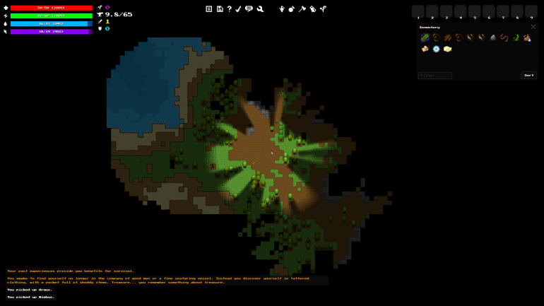
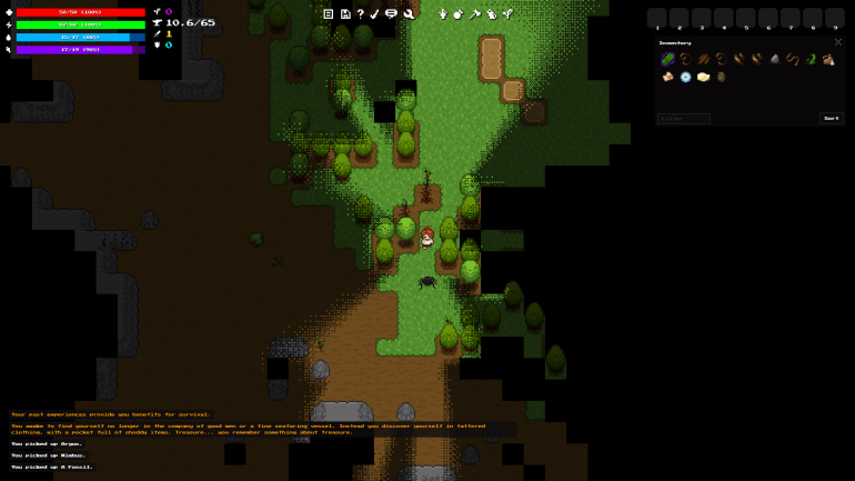
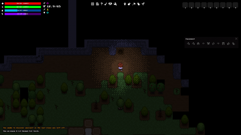
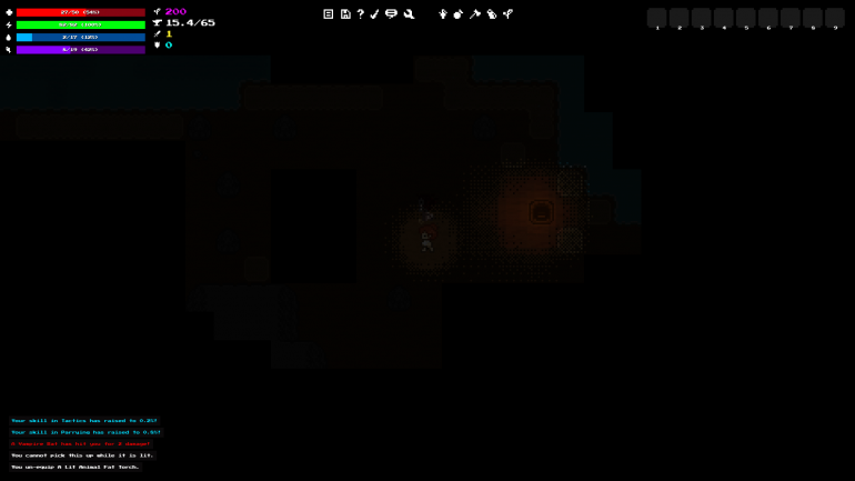
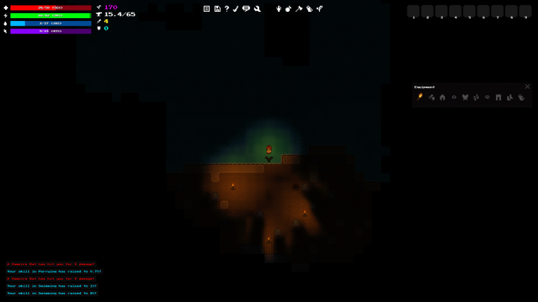
Looks really good! I much prefer this over the previously-shown method of just having a black radius around the character.
The only suggestion I can think of would be to dither the edges of the “known but not in LOS” tiles, because the fancy LOS dithering makes it look a bit odd now that tiles on the edge of your explored map are still very square. It stands out a bit.
At this rate Wayward 2.0 should be a big success, I hope!
I can’t wait for 2.0, all of the new features look amazing!
Hey, Please keep it up, I would love to be able to buy and play wayward! 😀
It looks really great!
Do you think 2.0 will be out in the next 6 months? I’m so excited to play @__@
Yep, most likely. We are mostly doing bug fixes from the testers now. You can keep up to date with our Trello: https://trello.com/b/PWX1Hpjn/wayward-todo
Wow, awesome! I can’t wait for all this but we can change our character skin right?